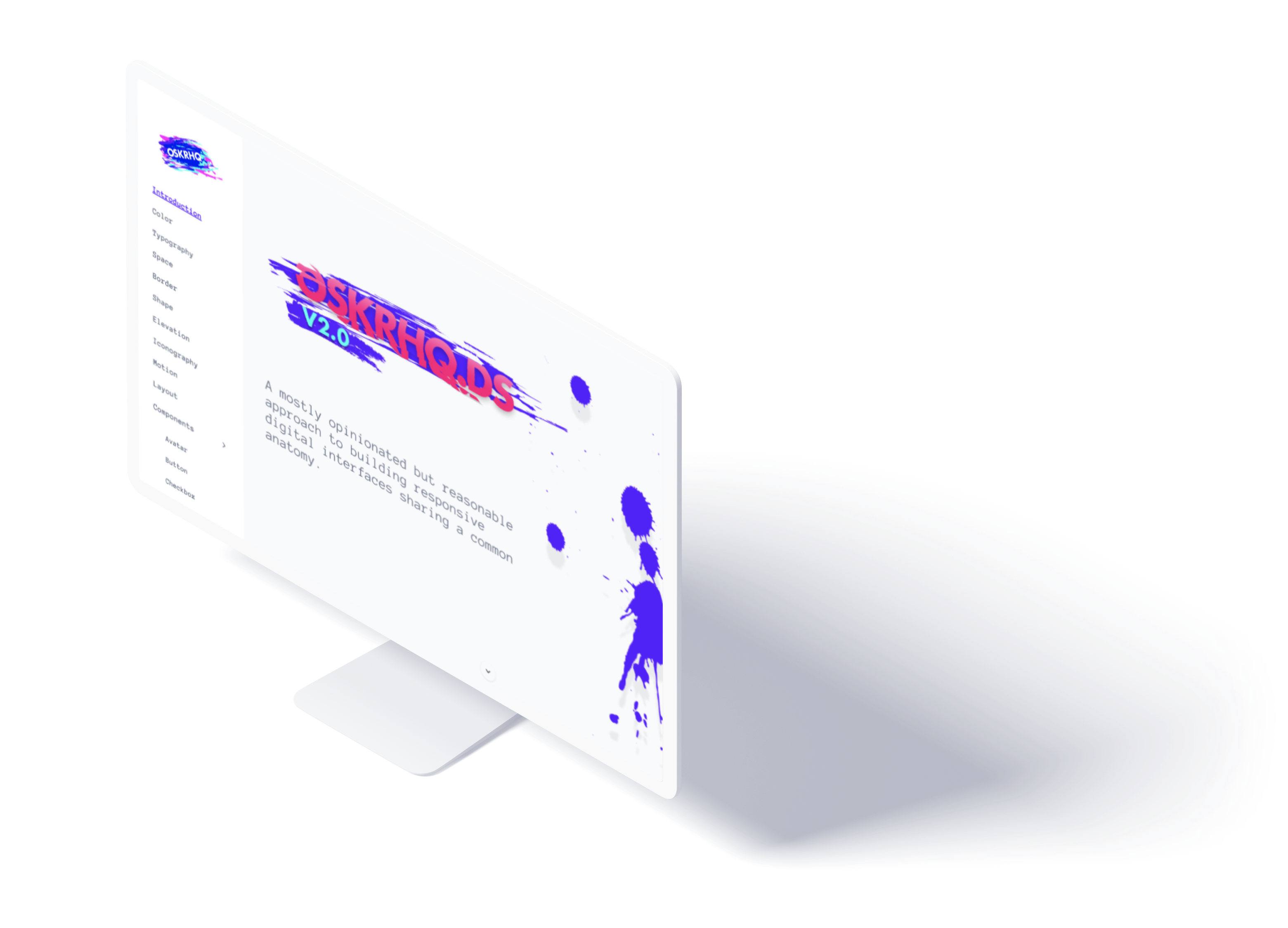
OSKRHQ.DS 2.0
OSKRHQ.DS is a Design System for my personal brand. More specifically, it's a Design Guide and a Component Library using ReactJS with a unique SASS architecture. This website, and every personal project I work on, consumes the system in code and design. It's also an open-sourced project, and has an accompanying Figma Library.
I built it as a Proof of Concept to persuade design and dev teams at a past employer to build one for the company, and I have been adjusting it based on my learnings while working on LinkedIn's new Design System. Below is the story.
Problem
As a designer or developer, you are a walking, talking brand. The products and services you produce become an extension of that brand. As you create artifacts over time, your identity tends to get diluted since you are typically building these artifacts in isolation, or end up building the artifacts from scratch. This creates fragmented experiences for your audience as they move from one artifact to the next. This holds true for an individual or an organization.
Hypothetical Solution
If inconsistent artifacts of design and code dilute a brand and its extensions, then implementing a Design System should create a harmonious identity felt by a targeted audience.
Constraints & Considerations
Provide solutions for both designers and developers, create a common language abstracted from absolute values, and support mobile web and desktop displays.
Role
Creative Director, Designer, Developer, and instigator.
Tools
ReactJS, Figma, SASS, Storybook, Gatsby, Design Tokens, Framer Motion, and Coffee.
Primary Users
Freelancers, Designers and Developers.
Duration
Mar 2018 - Present
Platforms
Mobile web and Desktop

Below is a really cool story of how a small team built a Design System through collaboration and camaraderie between design and development teams without business, product or management support...
Empathize
Although I am ultimately a designer, I also code and have worked as a UI developer in the past. This has allowed me to be part of both worlds, Design and Development, which has made me feel the pains and frustrations shared by both sides. For being perceived as different, it is funny to me how alike these pains are.
My obsession with systematizing design began in Q2 2017 while working at Ultimate Software. I remember vividly a time I grabbed lunch with a coworker and found ourselves sharing a mutual frustration with not being able to stay in sync amongst the designers - a problem which caused inconsistencies in our interfaces. While at Ultimate, I also had the opportunity to work as a UI developer where I noticed devs too had the same problem. The difference was the dev community had come up with clever ways of solving this as well as many other problems like versioning and continuous deployment. I began to wonder if these solutions were only available for Development or if I could somehow extend these solutions to my design team.
Define
It does not matter if you are on a design team or development team, it all boils down to speed, synchronization and visibility. A designer does not want to redesign a button and a developer does not want to re-code that button. Doing so means adding time, expenses and impacting the end user negatively by creating a fragmented experience.
The front-end Development community came up with the notion of building User Interfaces via Component Architecture. Although an overly simplified definition, a Component Architecture essentially means that you can code one button and the entire development team can use an instance of that button and not have to build it from scratch. Additionally, you can update that button and the entire team will get the update. This holds true for more complex elements with deeply nested components as well. In addition, Devs also use Git to stay in sync and account for how these elements change over time through versioning.
At the time, Sketch App had just come up with Sketch Symbols which are essentially reusable pieces of design just like components are in code. This was pre-UI kits. No one really knew what those were back then.
After spending a few weekends working on this, and a lot of trial and error, I created a UI Kit for my design team and ended up using Brand.ai (a tool for syncing symbols) so we could all be in sync. I also constructed the Symbols so they would match 1-to-1 with the components in code, even matching the Overrides of the Symbols to the API's of the components (Component Attributes). This removed any confusion or ambiguity that could arise when handing over the designs to devs. Just having this UI Kit being part of the design process helped us tremendously in building our very own Design System, Ignite, and then making it part of the Ultimate Software culture. Below you can see a video of the proposal I presented to my boss for the UI Kit showcasing the process and efficiency.
I switched jobs in Q4 of 2017 and moved to the Bay Area to build a new Design System for Ellie Mae. Unfortunately, the company did not consider building or maintaining a Design System a priority. Talking to developers and designers and seeing how fragmented our experiences were in our 20+ products, I felt very strongly about the need to make this initiative a very high priority, if not to my company at least to me... I love side projects where I have the opportunity to learn and add value, so I moved this to the top of my list.
I think the best way to sell an initiative is by demonstrating it so I did just that; I created a Design System for myself first and then used it to showcase the benefits and the concept - a Minimum Viable Product I could use for my personal brand and benefit the company; kill two birds with one code repo. My requirements became:
- Benefit Development and Design equally
- Based on my Anatomy of the UI Principles written by me on Medium
- Has to be flexible and adaptable so that any person can grab the system and make it their own
- Have a Component Library built in ReactJS
- Support all the design artifacts or products I make in the future including apps, websites, presentations, medium posts, etc
Ideate & Prototype
The first thing I did was a Style Sheet for my system based on the personality I wanted to convey. I write about this process in this Medium post - Humanizing interfaces. Cheesy but it works.

From that, I created a UI Kit in Sketch with smart Symbols for the system. This allowed me to fine tune my colors, typography, space, depth, and iconography in design before I started coding the components and the SASS architecture supporting them. Feel free to play around by downloading the Sketch file here.

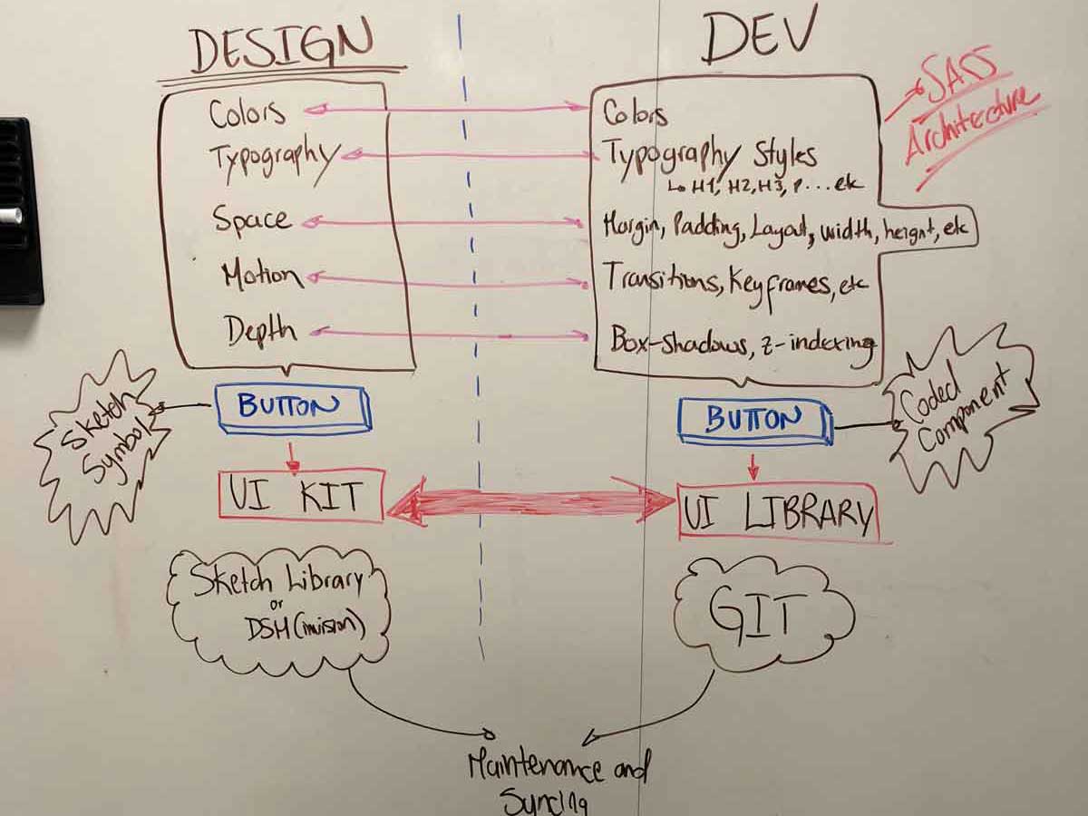
After designing a few Symbols in Sketch, I focused on architecture. I created SASS Mixins and Functions that allowed me to compose UI elements with the same sub-atomic parts. What are sub-atomic parts? Every UI element you interact with in digital interfaces is composed of something I call The Anatomy of UI; Color, Typography, Space, Motion, Depth, and Iconography. If you architect a framework for these and connect them using CSS preprocessors like LESS or SASS, it is easy to make products that feel cohesive since every element is composed out of the same “DNA” or sub-atomic parts. Check out my Medium post series if you are interested 🤓.
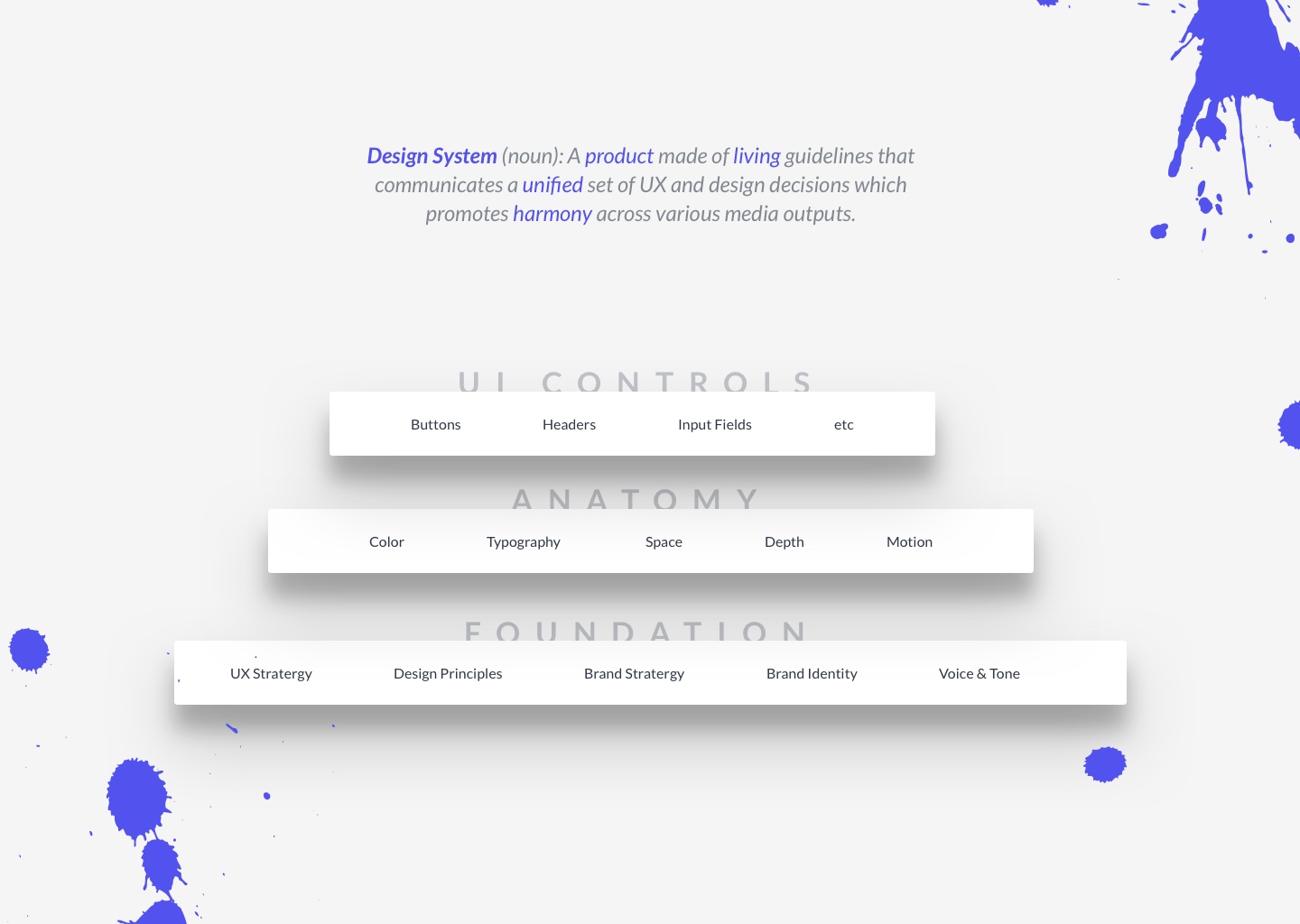
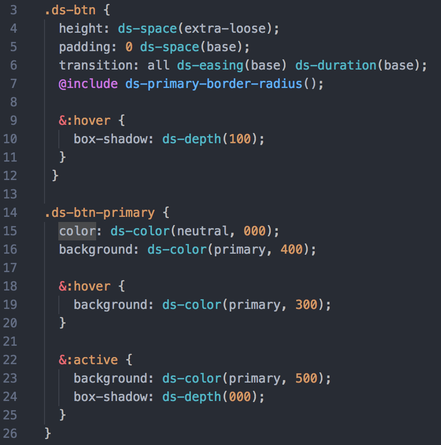
A robust SASS architecture limits developers on what CSS values they can hard-code. If they must hard-code values, they must do so consciously since that goes against the symbiosis of the system. After all, a System is a set of connected things or parts forming a complex whole. All of the buttons you see below, for example, were coded with the SASS architecture I put together. Below you can also see the code for the Primary button as an example. If you notice, each CSS declaration is connected to the system and nothing is hard-coded. Additionally, each sub-atomic definition follows predictable scales. If you want to know more about this, check out the System's website. I explain this in detail there.
Test
As soon as I had a few components constructed, I published the design system as a Node package. This way I could import it as a dependency for every project I create in the future, also allowing others to consume it or “fork” it. The first “product” consuming the system was the website that explains the system itself. The second “product” consuming the system was my portfolio, which is this website. If I make any updates to Color, Typography, Space, Motion, Depth or Iconography in my system, the updates will be reflected on all the products consuming it. Although most of the time I would want to update all “products” to the latest version of the system, the system follows semantic versioning so I don't have to update all if I don't want to. If you would like to install it and play with the code just run:
npm i --save oskrhq-design-system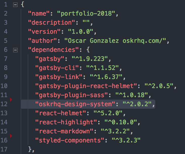
After I felt confident I had a solid MVP, I showed it to a couple of developers as well as our UI Architect and two designers. Without hesitation they wanted to build the same thing for our company. Soon after we had a team of eight coding and designing on their own time since we still did not have the backing of management at the time. Below is the result of a whiteboard session where I explained what the system was and how it bridged the gap between Design and Code.
Implement
We started building the system in June 2018. We used Storybook for our construction environment, ReactJS for our UI framework and the SASS architecture I used on OSKRHQ.DS. We took a User Centered design approach to this since the design system is meant to be used by both Designers and Developers. We focused heavily on documentation, testing, and adoption. We even had an adoption plan for Ellie Mae's products based on Nathan Curtis' article - Adopting Design Systems. We took time to compose the core components and consumed them so we could get a feel for how it would be to use the system as a consumer and user. Tweaks were made as we learned.
The Design System also has a UI Kit which I constructed and maintain for all designers. We are currently exploring tools like html-sketchapp, compositior.io, and react-sketchapp to see if we can get development and design even closer.
We are also making Accessibility a priority by constructing and testing every component with it in mind as well as teaching developers and designers to communicate in a new language. We no longer communicate in HEX values or pixels. We communicate intention. Instead of referring to red as #E34256, we now say danger - scale: 900 and when talking about dimensions, margin, and padding; small, medium, extra-large, etc. Check out OSKRHQ.DS website where I explain this in detail.
While it is still very early for this system, it has already proven its value to the company. As of late June 2018 - 3 weeks after starting, four Ellie Mae products are starting to adopt it as-is. I am confident the system is well on its way to becoming the way we build interfaces at Ellie Mae in the future. All of this, without mandate from management, something I am really proud of. Not because I built a POC, but because we were able to have Development and Design work *together* to solve a common pain. It shows how much can be achieved when teams join forces with one vision in mind.
Theming the system
On my side, OSKRHQ.DS supports theming. I wanted anyone to be able to fork the code repo in Github, change a couple of values in one place and be able to have a Design System that felt like their own with their unique personality and brand identity. Below you can see it in action shifting from one theme to another.
What's next?
If you notice from the OSKRHQ.DS source code, styles are completely decoupled from the UI Framework. In the case of my design system, I am using ReactJS to create the components, but I wanted anyone to benefit from the SASS architecture regardless of technology. That was my approach until I learned about CSS in JS. I really want to migrate my SASS Architecture to live purely in JS as the flexibility and modularity offered by platforms like Styled Components or Glamorous make the system extremely robust. All the SASS Mixins and Functions in my SASS architecture could easily be replicated in JS. This is what I want to tackle next. Lastly, marketing; although I already have two contributors, I would love for more people to contribute to the system and create an open-source beast. To be determined…
lessons learned
The most notable thing is that this project was born and materialized from the needs of the users of the product (developers and designers) through camaraderie, which I think is a beautiful thing. This was not mandated or prioritized by management. Sometimes a small POC like what OSKRHQ.DS is enough to start something bigger. It is just like David said in the Prometheus movie…
This project taught me that sometimes “going rogue” means delivering value to the business even when leadership wants your focus on other things. It also taught me that collaboration and having a purpose are amazing motivators for people. Everyone wants to belong to something that delivers value. That is why we have so many open-sources projects out there including my design system.
Finally, the project taught me how similar the problems of Design and Development are. This actually excites me the most because there is a lot of room for innovation in bridging the gap between design and implementation.
About · osk.gonzo@gmail.com · Github · Codepen · Codesandbox · Medium · Dribbble · Instagram


