Feature Introduction
I led the creation of a Design Framework inspired by one of my articles ("Design for conversations. Not screens"), Open World Game Design, and Disney's approach to personalization. The framework guides designers on how to properly introduce features to LinkedIn users while carefully considering contextual relevance over a user's journey and conversational competence. The framework draws parallels between ordinary spoken conversations in the physical world (introductions in this case) and Digital Interaction Design.
Problem
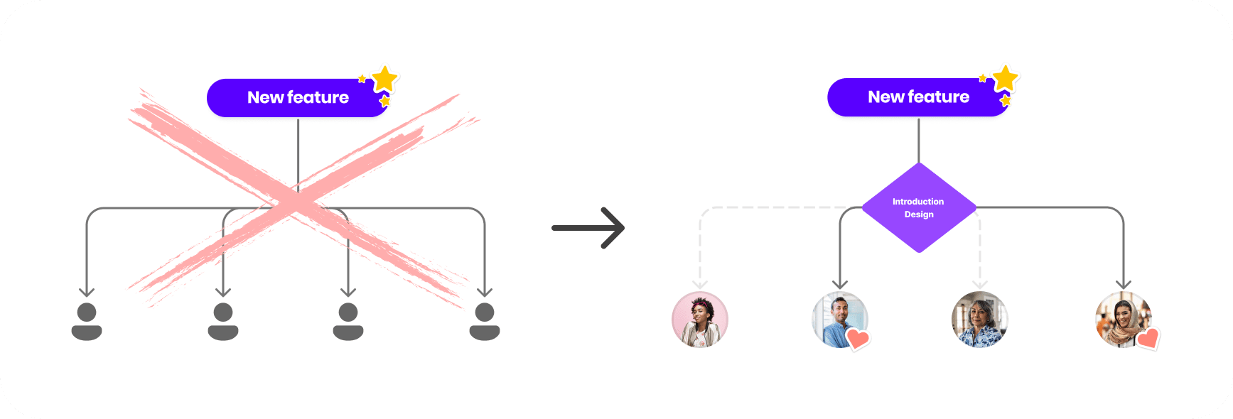
When LinkedIn launches a new feature, we generally introduce it to everyone without regard for relevancy.
There were three related problems we were trying to solve:
- As a user, I want to know about features that would help me get the most out of LinkedIn.
- As a designer, I would like to let the right users know about features they may find valuable.
- As a UX Infrastructure team, we would like to evaluate the quality and effectiveness of these introductions
Solution
LinkedIn content engines already match content with the right audience so users can engage with content they may find most valuable.
Suppose we introduce features to users at contextually relevant moments by guiding designers in identifying the right context, user, message type, and components while also evaluating how effective these are. In that case, we can provide lasting value to our users, helping them with their individual immediate and long-term goals and objectives on our platform.
Role
Design Lead - I led the project from start to finish. My most significant contribution was synthesizing the data gathered by integrating Conversational Design principles with digital interaction design.
Constraints & Considerations
We have heard from users that LinkedIn's UI is too cluttered and they receive too many notifications.
Users
New, frequent, and infrequent users of LinkedIn's consumer products.
Duration
April 2022 - Present
Tools
Figma and Protopie
Platforms
Native Mobile and Responsive web

Understand
The framework started by identifying a pattern becoming prevalent in the industry.
These prompts represented an accessibility problem as product teams were using Tooltips. These elements can not contain interactive elements like links, inputs, or buttons and must be activated by the user. In native mobile, they are also usually placed in the last place in the focus order, alienating keyboard and screen-reader users and often obscure other important data. At the time, my team and I were working on rolling out Dark Mode, so we decided to provide a temporary solution that would address these issues, knowing that we would have to revisit this pattern in the future.
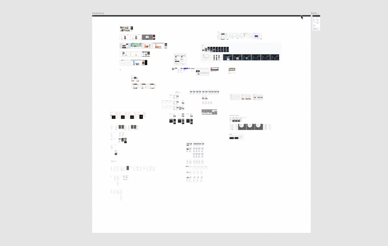
Although not perfect, we believed that the linear navigation via focus order would help keyboard and screen-reader users discover the features and address sighted users' needs as well. After rolling out this solution, however, we noticed that teams started to overuse the pattern, often trying to compensate for a lousy interface design. Every team wanted to call out their features, and since teams often work on isolated features, users complained about the number of prompts they saw. We then did a comprehensive audit of all of the instances that we would identify to identify themes:
There was an apparent disregard for contextual relevance when introducing features, as every user was getting the same introduction to a feature without regard for the context and timing.
Define
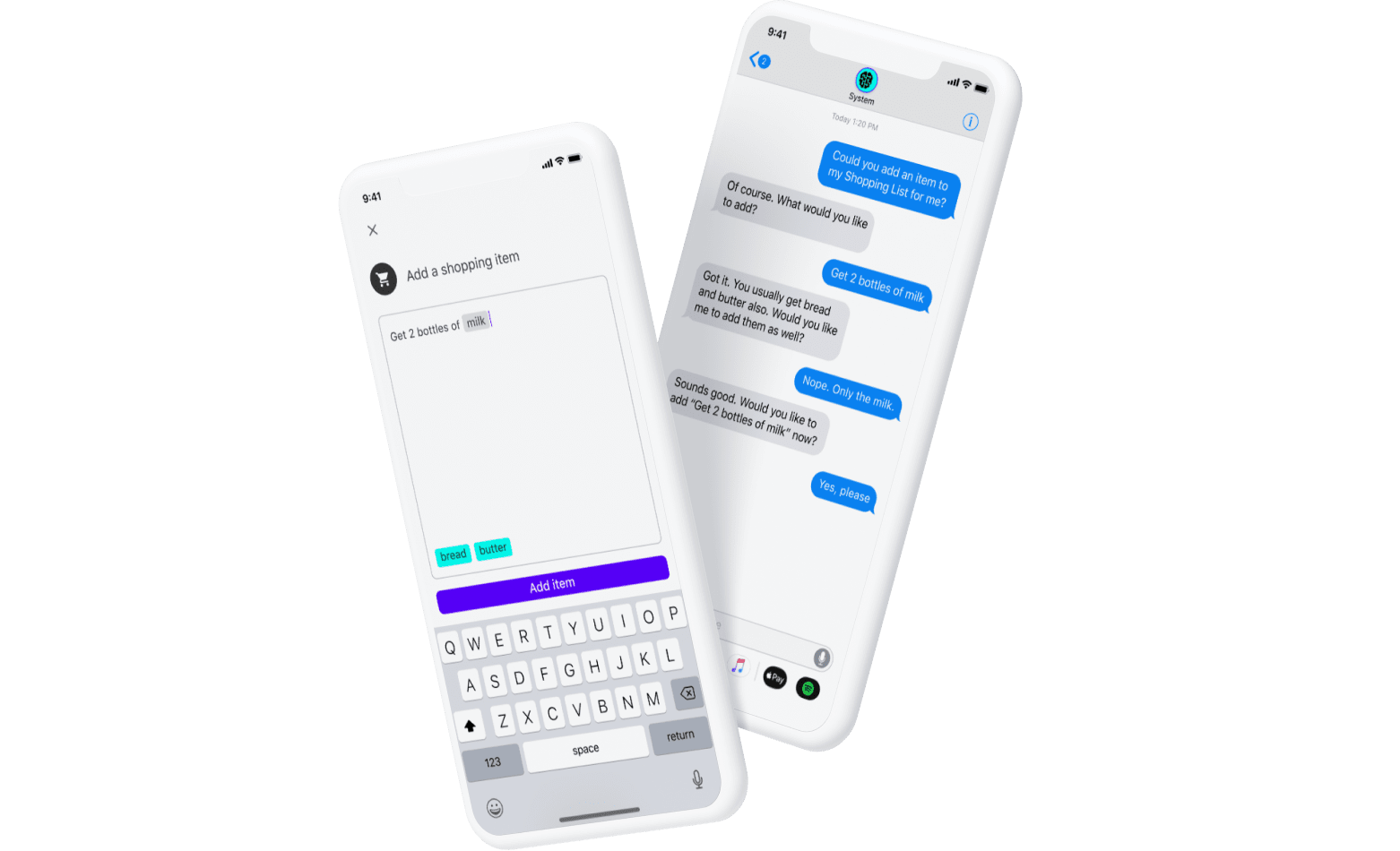
In early 2020, I wrote an article drawing parallels between Conversational Design and digital interaction design. We wanted to see if approaching these interactions like a spoken conversation would help, so my team and I decided to create a design framework to help teams Design these Introductions through conversational competence. Furthermore, we wanted to provide specific components that teams could use, delivering clear guidance on how and when to use them properly.
Establishing Relevance
Teams are naturally proud of the features they design and would like users to engage with them. However, determining contextual relevance when introducing something to another person is extremely important. We do it unconsciously in the physical world when introducing a friend to another, so we wanted Designers to consider that.
Principles
Before ideating, we wanted to create a set of principles that would help us evaluate the quality of these introductions and our solutions.
- Relevant: Presented to the right user at contextually relevant moments and circumstances.
- Valuable: Help members with their immediate or long-term goals and objectives on our platform.
- Actionable: Learning by doing is more effective than reading instructions.
- Conversational: The goal is not to force users to notice or engage with the feature; let them find and engage with the features on their terms.
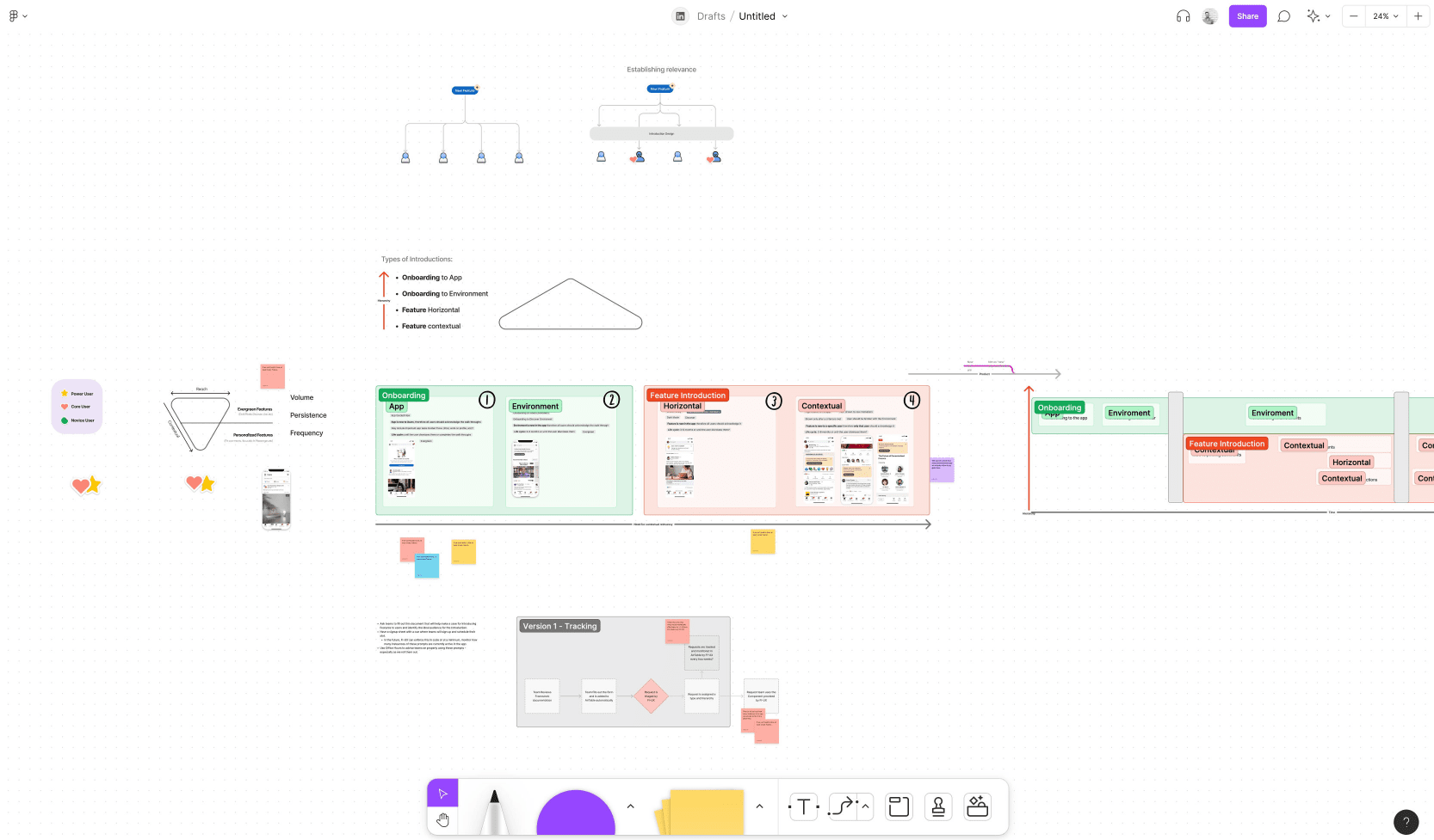
Introduction Types
We did a Figjam session with multiple partners to segment the types of introductions we accounted for in the inventory. This would allow us to establish a hierarchy and usage rules for volume, persistence, and frequency.
We were able to segment introductions and assigned the following hierarchy:
- Onboarding to the app: Prompts designed to show a member around the application including key tasks ("touring around the house").
- Onboarding to an Environment: Prompts designed to show members around a new specific environment within the app ("touring around a new room").
- Horizontal Feature: Prompts designed to introduce members to important app improvements ("Dark Mode, accessibility improvements, etc."")
- Contextual Feature: Prompts designed to introduce members to contextual features to the app ("Now you can pin comments in your posts.")

Ideate
Inspiration
Aside from examining Conversational Design and how other apps in the industry were solving this problem, we also wanted to get inspired by other more unconventional design practices.
Game Design
In Open World game design, the player's interface, prompts, and capabilities adapt based on where the player is in the game, how many resources they have acquired, and the missions or journeys they have chosen to take.
Disney Personalization
When you plan a trip to Disney, the company may give you the option to tailor your experience to a specific occasion or intent (birthday, meeting your favorite character, anniversary, etc.). This personalizes their experience, creating a deeper connection to the brand. Since all experiences are individual, we wanted to see if there was an opportunity for us to capture the user's intent or goals within LinkedIn and surface features that may help them achieve those goals.
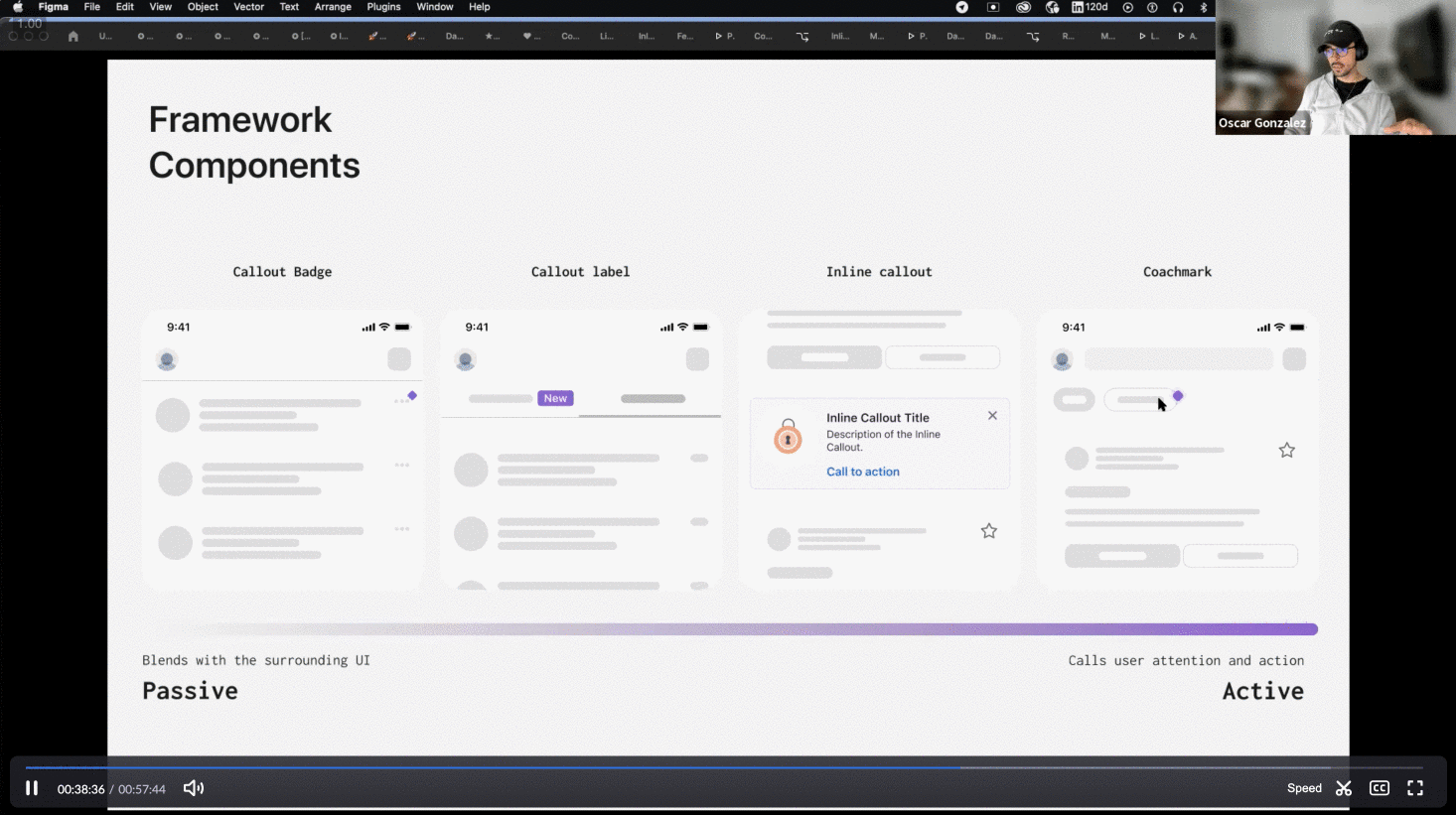
Components
We landed on creating three components that we were confident would help us deliver accessible and contextual introductions.
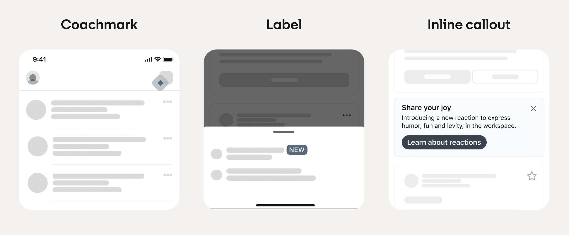
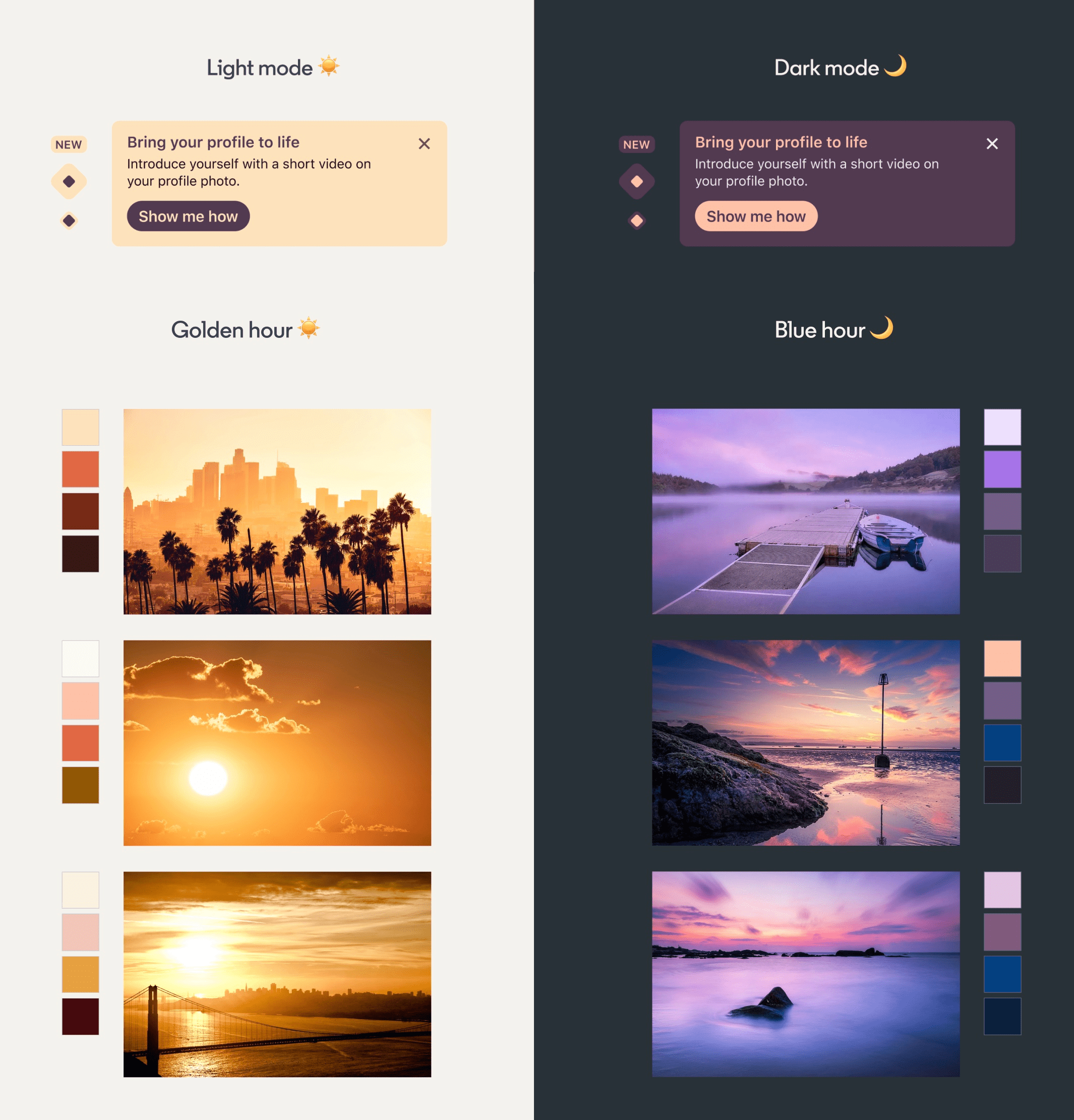
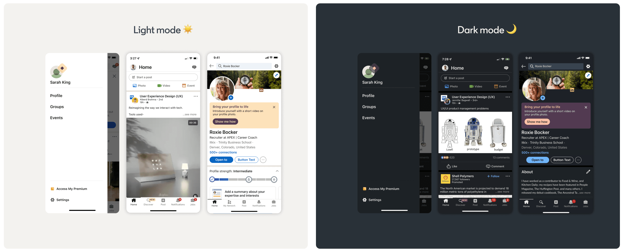
Visual and Motion Design
My team also saw an opportunity to create a Color & Shape system for these components so that they would be recognizable, visually different than the rest of the UI, and a chance for us to introduce a bit of personality.

We also explored paring the Introduction with motion as a form of communication.

Prototype
We created a small deck of the framework and four prototypes that illustrated solutions addressing most of the use cases we gathered with the audit, carefully considering relevance and accessibility.

Validate
We partnered with Designers that were very interested and invested in this project, and we asked them to help us gather feedback from their teams.
In a small workshop with our engineering team, we discussed implementation ideas and investment costs.
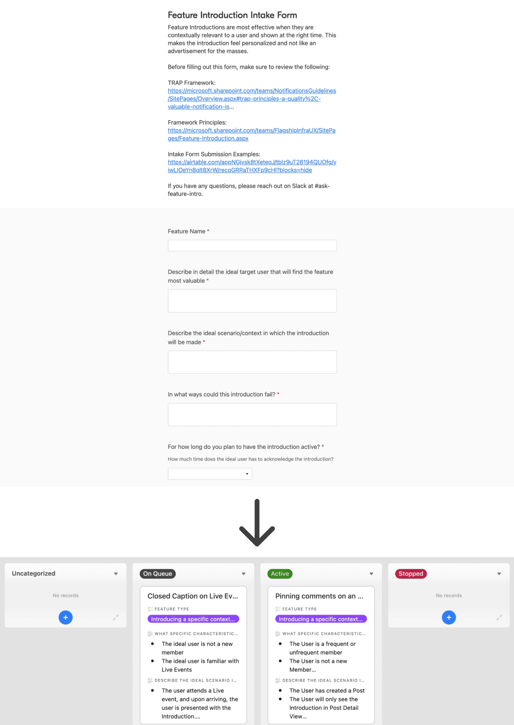
After getting validation and feedback from designers and engineers, we presented the framework to Design Leadership. We got great feedback and positive remarks, and they also advised us to pair the framework with a way to track these introductions.
Although it is not perfect yet, we created a process requiring teams to record their Introduction on Airtable detailing the relevancy of the feature to the user so the team can use our components. They allow us to almost guarantee designers think through all appropriate considerations and will enable us to track their volume.
About · osk.gonzo@gmail.com · Github · Codepen · Codesandbox · Medium · Dribbble · Instagram


